What a Foundation Shade Name Can and Cannot Tell You
Learn what a foundation shade name and swatch can tell you, where they fall short, and how to compare colors more thoughtfully before choosing.
The common mistake with a foundation shade name is treating it like a precise color code. “Warm Beige” may narrow the field, but it cannot tell you exactly how the product will look on your skin—or on your phone screen. Read the name as a clue, then use the swatch and other visible details to decide what to compare next.
Why does the name sound right but the shade look wrong?
Shade names are labels, not a universal system. One brand’s “neutral” may look pinker, yellower, or more muted than another’s. Words such as fair, tan, and deep usually suggest relative depth within a product range, while terms such as cool, warm, and neutral suggest an undertone. Brands do not apply those terms in exactly the same way.
There is another wrinkle: the name describes the product’s intended color, not a promise about the way it will appear on every person. Skin has its own surface color and undertones, and the product’s finish and surrounding light affect what the eye sees. A “golden” label is a reason to inspect for yellow or golden color—not proof that it will blend naturally.
- If the depth seems plausible but the color looks too rosy or yellow: compare nearby shades in the same depth range, looking for a different undertone.
- If the undertone seems plausible but the shade looks too light or dark: compare shades described as a different depth, without assuming the undertone changes with it.
- If both seem off: treat the name as a starting point and look at swatches from the same formula.
What can a swatch show that the name cannot?
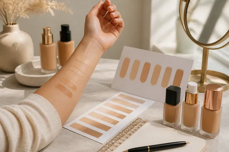
A swatch gives you a view of the actual product color, which makes it more informative than the label alone. Look for swatches displayed side by side in the same image and under similar lighting. A row can help you compare relative depth and whether neighboring shades lean pink, golden, peach, olive, or more muted.
Still, a swatch is not a direct preview of your own result. A shade shown on another person is influenced by that person’s skin, the thickness of the application, lighting, camera processing, and the screen displaying the image. A stripe on an arm may also look different from the same color placed near the face. Use swatches to rule out obvious mismatches and identify promising shades, not to infer an exact match.
Imagine you are comparing two shades labeled “light neutral” from different brands. One appears rosy in a clear, side-by-side product image, while the other appears more yellow. That gives you a useful reason to investigate the second shade if you want less pink in the color; it does not establish how either will look on your skin. Compare each one with adjacent shades from its own range before deciding what to sample.
Why does the online shade look different on my screen?
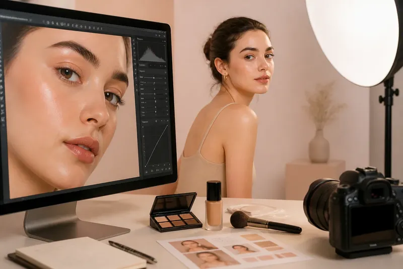
Displays can shift color. Screen brightness, color settings, room lighting, and image editing all affect a swatch’s appearance. A product image may also be photographed under lighting that makes a shade look warmer, cooler, brighter, or more muted than it appears elsewhere.
For a more useful comparison, check several images of the same shade: a product swatch, a lineup of neighboring shades, and, if available, an application image in natural-looking light. Keep your screen brightness consistent while comparing images, and avoid drawing conclusions from a small thumbnail. If the brand provides a shade description and a visual swatch, consider them together rather than treating either one as decisive.
When online images disagree, the disagreement itself is a sign to hold the choice lightly. It may reflect different lighting or displays, not a change to the product. A retailer’s swatch can help, but it may have been captured under conditions different from the brand’s image.
What should I check before choosing a shade?
Check these details in order. Each one answers a different question, so a matching word in the name should not outweigh a visibly unsuitable color.
- Depth: Does the swatch look broadly close to your skin’s lightness or darkness? Compare neighboring shades rather than relying on labels such as “medium.”
- Undertone: Does the color lean pink, peach, yellow, golden, olive, or muted? Treat the brand’s undertone word as a description to verify visually.
- Formula: Are you comparing the same product formula? A shade name used across different formulas may not look identical in every image or application.
- Swatch conditions: Were the shades photographed together, in similar light, and at a useful scale? A lineup is easier to compare than unrelated images.
- Screen conditions: Could brightness or color settings be changing what you see? If so, use the image to shortlist rather than settle the choice.
- Available return or sample options: Can you check the product on your own skin before committing? Review the seller’s current terms and product instructions.
For color cosmetics, labels and product instructions can vary by manufacturer, so check the specific product details when they affect how you assess or use it.
How should I compare foundation shades in person?
If in-person swatching is available, compare a small number of plausible shades from the same formula rather than spreading many unrelated colors across your skin. Ask for clean applicators or testers handled according to the store’s hygiene practices. View the colors in good, neutral light if possible; a warm store spotlight can make a shade appear more golden.
Observe the swatches after application instead of judging only by their first wet appearance. Some formulas can look different as they settle, so follow the product’s directions and allow the finish to become visible before comparing. If the store’s lighting is limited, step into a brighter area where that is permitted, or treat the comparison as provisional.
Try to compare on the area where you want the product to blend, rather than assuming an arm swatch predicts the face. The goal is not to make skin look like a flat block of one color. It is to see whether the chosen shade appears harmonious against the surrounding skin in the light where you expect to wear it.
Can one shade name predict an exact match?
Do “warm,” “cool,” and “neutral” mean the same thing across brands?
No. These terms are useful shorthand, but brands may use them differently. Compare the actual swatch and nearby shades within the same range.
Can a swatch on another person tell me my shade?
It can help you understand relative depth and color direction, but the other person’s skin and the image conditions affect the result. Treat it as a comparison point, not a direct match.
Why do two shades with the same name look different?
The names may belong to different brand systems or formulas, and the displayed images may use different lighting or screen settings. The shared words do not make the colors equivalent.
Is a shade name useful at all?
Yes: it can help narrow a range by suggesting depth or undertone. Pair that clue with swatches and product-specific comparisons instead of expecting the label to settle the choice.
A foundation shade name is most useful when it tells you what to inspect next: depth, undertone, or a neighboring swatch. Keep the brand’s labels within that brand’s own range, and let visible comparisons guide your shortlist. For an online choice, the foundation shade name can point you toward likely options; a screen image cannot replace seeing how the color relates to your own skin.